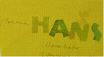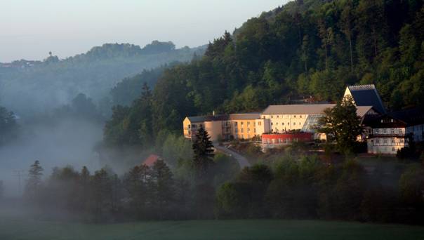
Haus Werdenfels
Waldweg 15 Eichhofen
D - 93152 Nittendorf
Tel. +49 9404 9502-0
www.haus-werdenfels.de/
10 Autominuten nord-westlich von Regensburg
|
2024
Montag, 8.4.2024, Beginn um 14.30 Uhr mit Nachmittagskaffee
Freitag 12.4.2024, Ende um 13.00 Uhr nach dem Mittagessen
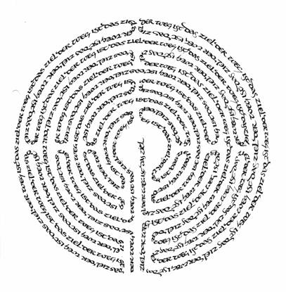
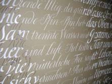
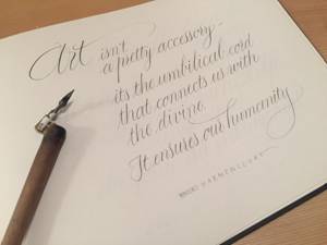
Meditation und Schrift„Der Geist führt, der Körper folgt“, unter dieser Prämisse „durchwandern“ wir eine Woche in
geistiger und körperlicher Konzentration. Kalligrafische Aspekte des Schreibens werden
„erfahren“, Werkzeuge und Techniken dazu kennengelernt und angewendet. Stille Meditationen
und Bewegungsmeditationen durchwirken die Woche ebenso wie eine Schärfung der Primärsinne.
Kommen Sie mit bewegungserlaubender Kleidung.
Zum Schreiben und Kalligrafieren bringen Sie mit:
Bleistifte, Wachsmalkreiden und Papier.
Bandzugfedern, Tinten und Federhalter können beim Kurs erworben werden.
Weitere gewohnte Schreibgeräte können Sie gerne auch mitbringenReferent:
Johann Georg Maierhofer, Kalligraf und Autor
Master of Arts in Speech Communication and
Rhetoric (Univ.)Teilnahmegebühr (Kursgebühr, Übernachtung, Vollverpflegung) bitte in Haus Werdenfels erfragen.
Information und Anmeldung:
Haus Werdenfels
Waldweg 15
93152 Nittendorf bei Regensburg
Tel: (09404) 9502-0
Fax: (09404) 9502-950
E-Mail: Buero@Haus-Werdenfels.de
www.haus-werdenfels.de
Telefon ist werktags besetzt
von 8.30 bis 11.30 Uhr und
von 13.00 bis 16.00 Uhr
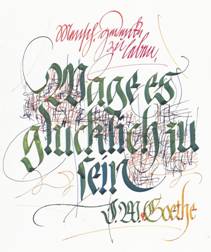
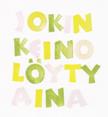
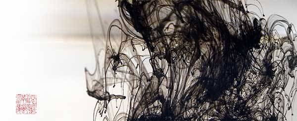
Schreiben ist mehr als Buchstaben zu Papier bringen
Handschrift ist Körperausdruck mit allen Sinnen
Schrift ist Tanzen mit dem Stift in der Hand
Sprechen Sie diese Aussagen an?
Dann kommen Sie eine Woche mit auf den AbenteuerurlaubSchrift und Meditation
Sie erleben, dass Schreiben mehr ist, als sie bisher meinten, erleben die Kraft dieses körperlichen Ausdrucks in seiner Vielfalt. Verweben tut sich das Kursgeschehen mit stillen Meditationen und Bewegungsmeditationen: Gehmeditation, Herzmeditation, Qi-Gong Einheiten.
Seien Sie bereit für neue Erfahrungen und eine erlebnisreiche Woche.
Materialien: bequeme Kleidung, gewohnte Schreibgeräte, Papier. Alles andere ist vorhanden.
BISHERIGE KURSE
Montag, 11.9. 2023, Beginn um 14.30 Uhr mit Nachmittagskaffee
Freitag 15.9.2023, Ende um 13.00 Uhr nach dem Mittagessen
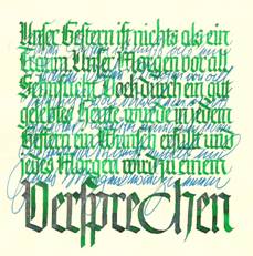
Das Formenspiel der Fraktur ist deutsche Tradition und lebensfrohes Bewegungsspiel. In dieser Werkwoche werden Sie durch den Formenreichtum der Fraktur geführt. Grundlagen und Erweiterungen werden erklärt, geübt und experimentell erweitert.Material: 3 mm Brause Bandzugfeder*, Federhalter*, Tinte*, Pinsel zum Befüllend der Feder*, Papier*, Lineal, Bleistifte, Farb- und/oder Wachsmalstifte und wenn vorhanden weitere Kalligrafiematerialien * kann beim Kurs erworben werden
Referent:
Johann Georg Maierhofer, Kalligraf und Autor
Master of Arts in Speech Communication and
Rhetoric (Univ.)
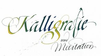
Kalligrafie und Meditation
12.9.-16.9.2022
Montag, ab14.30 Uhr bis Freitag 13.00 UhrKalligrafie ist mehr als Buchstabenschreiben so wie Meditation auch mehr als still dasitzen ist.
Das Motto dieser Werkwoche ist:
KRAFT IN DIE FORM in die Buchstaben und auch in uns und dann aus uns heraus.
Wir spielen mit unserer Handschrift hin zu Antiqua-Formen und wieder zurück.
2021
Kalligrafie und Meditation
Montag, 27.9 - Freitag, 1.10.2021
Kalligrafie ist mehr als Buchstabenschreiben so wie Meditation auch mehr als still dasitzen ist.
Das Motto dieser Werkwoche ist:
KRAFT IN DIE FORM in die Buchstaben und auch in uns und dann aus uns heraus.
Wir spielen mit unserer Handschrift hin zu Antiqua-Formen und wieder zurück.
Für Anfänger und FortgeschritteneMaterial:
Papier (ca. 40 Blatt DIN A 4,
ca 20 Blatt DIN A 3)
Bandzugfeder 3 mm *
Tinten * (auch möglich: Gouachen, Aquarellfarben)
Federhalter *
Spitzpinsel zum Befüllen der Feder *
Wasserglas
Bleistifte und/oder Farbstifte und/oder Wachsmalkreiden
* können beim Kurs erworben werdenTeilnahmegebühr (Kursgebühr, Übernachtung, Vollverpflegung) bitte in Haus Werdenfels erfragen.
Information und Anmeldung:
Haus Werdenfels
Waldweg 15
93152 Nittendorf bei Regensburg
Tel: (09404) 9502-0
Fax: (09404) 9502-950
E-Mail: Buero@Haus-Werdenfels.de
www.haus-werdenfels.de
Telefon ist werktags besetzt
von 8.30 bis 11.30 Uhr und
von 13.00 bis 16.00 Uhr
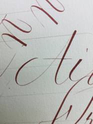
Anglaise, Copperplate, Englische Schreibschrift
drei Namen für eine Schrift
Montag, 7.6. - Freitag, 11.6. 2021
Diese Schrift des gebildeten Bürgertums vergangener Jahrhunderte mutet leicht, schwungvoll und elegant an. Für die Kalligrafie bietet sie durch ihren Variantenreichtum viele Möglichkeiten, das jeweilige Können zu erweitern. Druck und Loslassen stehen im Vordergrund, die rhythmische Bewegung der Schwellzugfeder erzeugt das einheitliche SchriftBILD.
Durch die Werkwoche führen Sabine Danielzig und Johann Maierhofer.
Sabine Danielzig aus Gräfrath unterrichtet seit über 10 Jahren diese spezielle Formensprache und ist vielen aus ihrem Atelier Brief und Siegel bekannt.
Johann Maierhofer ist langjähriger Referent an der Akademie Schwerte und ermöglicht bei diesem Kurs in der Zusammenarbeit mit Sabine Danielzig den Teilnehmern ein breitgefächertes Lernen und Üben.Für Anfänger und Fortgeschrittene
Material:
Schwellzugfedern* (z.B. Brause 66 ef ; Gillot 303; J.B. Mallat 10 ef; J.B. Mallet Oblique extra rapide 22 ef)
Winkelfederhalter*
Federhalter*
Papier*
Eisengallustinte*, auch möglich: Nussbaumtinte*, Gouachen, Reibetusche
Bleistifte, auch möglich: Farbstifte, Wachsmalstifte, Aquarellfarben
Lineal und Geodreieck
*können beim Kurs erworben werdenTeilnahmegebühr (Kursgebühr, Übernachtung, Vollverpflegung) bitte in Haus Werdenfels erfragen.
www.briefundsiegel.de
www.schriftkunst.de
Anmeldung in Haus Werdenfels:
Haus Werdenfels
Waldweg 15
93152 Nittendorf bei Regensburg
Tel: (09404) 9502-0
Fax: (09404) 9502-950
E-Mail: Buero@Haus-Werdenfels.de
www.haus-werdenfels.de
Telefon ist werktags besetzt
von 8.30 bis 11.30 Uhr und
von 13.00 bis 16.00 Uhr
2020
Kalligrafie und Meditation
Montag, 28.9 . bis Freitag, 2.10.2020
Kalligrafie ist mehr als Buchstabenschreiben so wie Meditation auch mehr als still dasitzen ist.
Das Motto dieser Werkwoche ist:
KRAFT IN DIE FORM in die Buchstaben und auch in uns und dann aus uns heraus.
Wir spielen mit unserer Handschrift hin zu Italic-Formen und wieder zurück.
Für Anfänger und FortgeschritteneMaterial:
Papier (ca. 40 Blatt DIN A 4,
ca 20 Blatt DIN A 3)
Bandzugfeder 3 mm *
Tinten * (auch möglich: Gouachen, Aquarellfarben)
Federhalter *
Spitzpinsel zum Befüllen der Feder *
Wasserglas
Bleistifte und/oder Farbstifte und/oder Wachsmalkreiden
* können beim Kurs erworben werdenInformation und Anmeldung:
Haus Werdenfels
Waldweg 15
93152 Nittendorf bei Regensburg
Tel: (09404) 9502-0
Fax: (09404) 9502-950
E-Mail: Buero@Haus-Werdenfels.de
www.haus-werdenfels.de
Telefon ist werktags besetzt
von 8.30 bis 11.30 Uhr und
von 13.00 bis 16.00 Uhr
Anglaise, Copperplate, Englische Schreibschrift
drei Namen für eine Schrift
Montag, 20.4. - 24. 4. 2020
Durch die Werkwoche führen Sabine Danielzig und Johann Maierhofer.
Sabine Danielzig aus Gräfrath unterrichtet seit über 10 Jahren diese spezielle Formensprache und ist vielen aus ihrem Atelier Brief und Siegel bekannt.
Johann Maierhofer ist langjähriger Referent an der Akademie Schwerte und ermöglicht bei diesem Kurs in der Zusammenarbeit mit Sabine Danielzig den Teilnehmern ein breitgefächertes Lernen und Üben.Für Anfänger und Fortgeschrittene
Material:
Schwellzugfedern* (z.B. Brause 66 ef ; Gillot 303; J.B. Mallat 10 ef; J.B. Mallet Oblique extra rapide 22 ef)
Winkelfederhalter*
Federhalter*
Papier*
Eisengallustinte*, auch möglich: Nussbaumtinte*, Gouachen, Reibetusche
Bleistifte, auch möglich: Farbstifte, Wachsmalstifte, Aquarellfarben
Lineal und Geodreieck
*können beim Kurs erworben werdenwww.briefundsiegel.de
www.schriftkunst.de
Anmeldung in Haus Werdenfels:
Haus Werdenfels
Waldweg 15
93152 Nittendorf bei Regensburg
Tel: (09404) 9502-0
Fax: (09404) 9502-950
E-Mail: Buero@Haus-Werdenfels.de
www.haus-werdenfels.de
Telefon ist werktags besetzt
von 8.30 bis 11.30 Uhr und
von 13.00 bis 16.00 Uhr
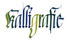
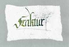
Kalligrafiewoche zur Fraktur
Montag, 16. September 2019 * 14.30 -
Freitag, 20. September 2019 * 13.00
Sie tauchen eine Woche ein in die Welt der Kalligrafie.
Am Beispiel der Frakturschrift erlernen, schulen und erweitern
Sie kalligrafisches Können. Im Wechselspiel von Anleitung und Übung
erfahren Sie die dieser Kunst innewohnenden Kraft.Material:
mindestens 50 Blatt DIN A 4, ca. 5 Blatt Papier mindestens 50 x 70 cm (möglich auch: Karton, Kalender, Packpapier),
Lineal, Bleistifte und/oder Buntstifte und/oder Wachsmalstifte, Spitzpinsel (Größe mind. 6),
Flachpinsel (empfohlen Da Vinci Junior Synthetics Größe 12), Wasserglas;
Bandzugfedern*, Tinte*, Federhalter* und gewohnte Kalligrafiematerialien (wenn vorhanden, z.B. Aquarellfarben, Gouache).
Für Anfänger und Fortgeschrittene
Anmeldung in Haus Werdenfels:
Haus Werdenfels
Waldweg 15
93152 Nittendorf bei Regensburg
Tel: (09404) 9502-0
Fax: (09404) 9502-950
E-Mail: Buero@Haus-Werdenfels.de
www.haus-werdenfels.de
Telefon ist werktags besetzt
von 8.30 bis 11.30 Uhr und
von 13.00 bis 16.00 Uhr
Meditation und Schrift
Montag, 08. April 2019 * 14.30 Uhr –
Freitag, 12. April 2019 * 13.00 Uhr
Der Regensburger Kalligraf Johann Maierhofer bietet wieder eine Woche zum Eintauchen in die kraftvolle Welt der Kalligrafie an.
Meditations- und Körperübungen gehen über in das Kalligrafieren.
Die Kraft der Formen wird geübt in einem kontemplativen Alphabet und einer freien Inter-pretation der Italic-Schriften. Die gesamte Bandbreite des kalligrafischen Ausdrucks wird dabei ermöglicht.
Jeder arbeitet seinem Können entsprechend.
Einsteiger und Fortgeschrittene sind herzlich willkommen, in der Kalligrafie die eigene Mitte zu spüren und sich auszudrücken.
Material: mindestens 50 Blatt DIN A 4 verschiede-ner Qualität, ca. 10 Blatt Papier mindestens 50 x 70 cm (möglich auch: Karton, Kalender, Packpapier), Lineal, Bleistifte und/oder Buntstifte und/oder Wachsmalstifte, Spitzpinsel (Größe mind. 6), Flach-pinsel (empfohlen Da Vinci Junior Synthetics Größe 12), Bandzugfedern, Wasserglas, Tinte und gewohnte Kalligrafiematerialien sowie für Entspannungsübungen bequeme Kleidung.
Kursleiter: Johann Maierhofer
2018
Kalligrafie: Kraft in die Form
Kalligrafie ist mehr als Buchstabenschreiben
Montag, 24.9..2018 um 14.30 Uhr mit dem Nachmittagskaffee
bis Freitag, 28.9..2018 um 12.00 Uhr mit dem MittagsessenNähe und Distanz, Druck und Loslassen, schnell und langsam - der Ausdruck des Körpers ist die Kalligrafie.
So fließt die ganze Person in den Prozess des kalligrafierens.
In Italic-formen und anderen wird die eigene Ausdruckskraft gestärkt und geschult. Formvariationen werden betrachtet und geübt.
Kalligrafische Grundkenntnisse sind für die Teilnahme wünschenswert.Material: mehrere Blei- und/oder Farbstifte, ca. 20 Blatt DIN A 4 Papier, ca. 20 Blatt größeres Papier (mind. 40 x 60) Tesa, Lineal, Spitzpinsel Größe 6-8,
Flachpinsel, Wasserglas, Bandzugfedern in verschiedenen Größen*, Tinte* und alle weiteren gewohnten Kalligrafiematerialien.
*können beim Kurs erworben werden.Kursleiter: Johann Maierhofer
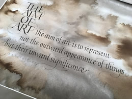
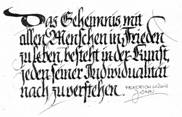
Aristotoles:
"Das Ziel von Kunst ist nicht, die äussere Erscheinung darszustellen, sondern ihre innere, tiefere Bedeutung."
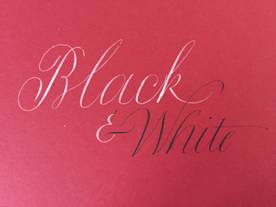
Anglaise, Copperplate, Englische Schreibschrift
drei Namen für eine Schrift
(ausgebucht)
Montag bis Freitag - 09.4.2018 -13.4.2018
Diese Schrift des gebildeten Bürgertums vergangener Jahrhunderte mutet leicht, schwungvoll und elegant an. Für die Kalligrafie bietet sie durch ihren Variantenreichtum viele Möglichkeiten, das jeweilige Können zu erweitern. Druck und Loslassen stehen im Vordergrund, die rhythmische Bewegung der Schwellzugfeder erzeugt das einheitliche SchriftBILD.
Durch die Werkwoche führen Sabine Danielzig und Johann Maierhofer.
Sabine Danielzig aus Gräfrath unterrichtet seit über 10 Jahren diese spezielle Formensprache und ist vielen aus ihrem Atelier Brief und Siegel bekannt.
Johann Maierhofer ist langjähriger Referent in Haus Werdenfels und ermöglicht bei diesem Kurs in der Zusammenarbeit mit Sabine Danielzig den Teilnehmern ein breitgefächertes Lernen und Üben.Material:
Schwellzugfedern* (z.B. Brause 66 ef ; Gillot 303; J.B. Mallat 10 ef; J.B. Mallet Oblique extra rapide 22 ef)
Winkelfederhalter*
Federhalter
Eisengallustinte*, auch möglich: Nussbaumtinte, Gouachen, Reibetusche
Bleistifte, auch möglich: Farbstifte, Wachsmalstifte, Aquarellfarben
Lineal und Geodreieck
Papier*können beim Kurs erworben werden
www.briefundsiegel.de
www.schriftkunst.deSeminarbeitrag einschließlich Unterkunft und Vollverpflegung: 495,00 Euro
Anmeldung in Haus Werdenfels:
Haus Werdenfels
Waldweg 15
93152 Nittendorf bei Regensburg
Tel: (09404) 9502-0
Fax: (09404) 9502-950
E-Mail: Buero@Haus-Werdenfels.de
www.haus-werdenfels.de
Telefon ist werktags besetzt
von 8.30 bis 11.30 Uhr und
von 13.00 bis 16.00 Uhr
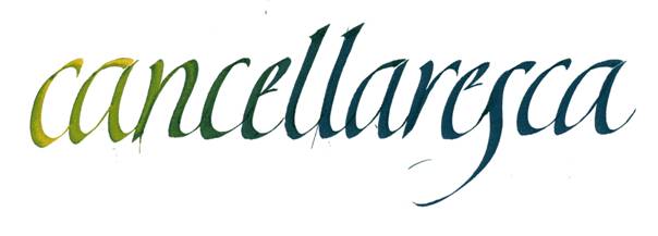
Kalligrafie am Beispiel der Cancellaresca
Grundlagen und Aussichten
Montag, 18. April 2016
bis Freitag, 22. April 2016
Kursbeginn: Montag, 14.30 Uhr mit Nachmittagskaffee
Kursende: Freitag, 12.00 Uhr mit Mittagessen
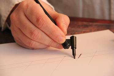
Kalligrafie ist Bewegung in Raum und Zeit ausgedrückt mit Körper und Geist.
Die Beherrschung der Arbeitsgeräte ist dabei entscheidend, ob die Kalligrafie gelingt.
Aus dem Körper fließen Formen und werden zum Alphabet.
Die Cancellaresca, ein grundlegendes Formenspiel der humanistischen (Italic) Schriften ist eine geeignete Spielwiese, um sich kalligrafisch auszudrücken und Texte zu interpretieren.
Der Kurs ist geeignet für Fortgeschrittene und Einsteiger.
Material:
Bandzugfedern*, Tinten* und/oder Gouachen, Spitzpinsel (empfohlen Größe 8), Wasserglas, Bleistifte und/oder Farbstifte, Wachsmalkreiden, Lineal, Papiere (größere und kleinere), Lust und Laune, Flachpinsel (Größe 10 oder 12).
* können beim Kurs erworben werden
Aus Formen werden Buchstaben
28.9.-2.10.2015 Montag bis FreitagKalligrafisches Arbeiten erfordert Geduld, Ausdauer und Disziplin - und gibt diese Qualitäten zurück.
Wir Formen aus unseren Körpern das Wollen des Lebens zu sich selber. Mittels kalligrafischer Grundlagen - Beherrschung von Druck und Loslassen, schnell und langsam, Nähe und Distanz - werden im Kurs Alphabete aufgebaut und Texte geformt.
Ein Kurs für Anfänger und Fortgeschrittene.Materialien: Bandzugfeder 3 mm, Federhalter, Tinte, Spitzpinsel Größe 6 oder 8 zum Befüllen der Feder, Papier (ca. 20 Blatt DIN A 4, mindestens 5 Bögen DIN A 3 oder größer), 2 Blei- oder Buntstifte oder Wachsmalkreiden, Lineal
Masterclass Denis Brown
13.4.2015 17.4.2015
Begin: Monday 2.30 pm with Coffee
End: Friday 12.00 am with lunch(see also:
Masterclass Denis Brown
8.4.2015 - 12.4.2015
in Schloss Spindlhof)
"Rhythm: from calligraphy to composition
Level: intermediate to advancedRhythm applies of course in lettering but also in composing the page. All who studied with me before will know the importance of rhythm in writing. It will be reviewed, to refresh your appreciation, or as an introduction to new participants coming for a first time. Then we shall move to consider how rhythm can be a force in designing a composition. Exercises will be given making patterns of repetition in undulating lines of writing and in text blocks artistically arranged on the page. As in lettering, we will acknowledge two sides to rhythm in composition, the structured and the improvised, and will aim to find a harmonious balance between the two for each individual participant.
STUDENT SUPPLIES:
Square edged dip-pens, (Brause size 1.5mm, 2mm, 2.5mm, 3mm, 4mm & 5mm particularly required in addition to your own preferred brand).
A range of any other writing tools you have (e.g. brushes, ruling pens, droppers, sponge brushes, etc
2" decorators paintbrush, or other tools capable of making really big marks easily
Ink; ruler; pencils; pad of practice paper A3 size or larger;
Also some A3 sheets of a cheap black paper such as sugar paper (this is for cutting out and arranging designs, not for writing on).
At least 12 large sheets of better quality paper including some sheets of black or dark coloured paper; gouache colours;
palettes including pots or plastic cups big enough to accommodate your largest tools, mixing and loading paintbrushes;
Scalpel and steel ruler, or else a pair of scissors.
Dancing the Italic
20.10. 24.10.2014
Begin: Monday at 3.00 pm
End: Friday at 12.00 amCalligraphyweek with Loredana Zega
www.kaligrafija.org/Level: intermediate to advanced
Kalligrafie mit Loredana Zega: Die slowenische Kalligrafin Loredana Zega unterrichtet erstmals in Deutschland.
Ihre expressive Ausdrucksweise fasziniert bei jeder Begegnung.
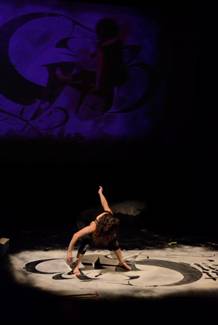
Ihr Tanz mit und ohne Pinsel in der Hand ist Kalligrafie pur.
Für die Seminarwoche hat sie ein einzigartiges Programm zusammengestellt:• tanzende italic mit der Metallfeder
• tanzende italic mit dem Flachpinsel
• tanzen der Formen auf Holz
• tanzen der Formen auf Kleidung
• tanzen der Formen auf Folie (Sgraffito Einführung in die Kratzputztechnik)
Alle, die in diese wundervolle Welt tanzender Kalligrafie eintauchen wollen, sind herzlich eingeladen, an dieser einzigartigen Werkwoche teilzunehmen.
Loredana Zega is meanwhile well know in europe. Her expressive personality and work is calligraphy pure: she is dancing the calligraphy with nib and without nib:
For this workshop she has created an unique programm:• dancing the italic with the metal-nib
• dancing the italic with the flat-brush
• dancing the forms on wood
• dancing the forms on t-shirts
• dancing the forms on polythene sheet (sgraffito)
Every calligrapher who likes to immerse in this wonderful world is dearly welcome.
Masterclass Denis Brown
28.4.2014 2.5.2014
Begin: Monday 3.00 pm with Coffee
End: Friday 12.00 am with lunch
Italics: Knowing the family.
Level: intermediate to advanced
Like most families, if you get to know them well, the unity between many different individuals (i.e., different types of italic) becomes clear.
The class will begin with a clear analysis of italic, neatly categorizing a wide range of variations. We'll practice two very different styles, and by encountering the same principles in both forms, you'll start to grasp the unity between them and among all italics. "Hybrid" scripts will also be introduced; learn how to breed modern varieties of historical scripts by imposing some of their characteristics on an appropriate form of italic arch. Celtic and Gothic hybrid scripts will be introduced in this manner; hands with a contemporary rhythm, thus avoiding pastiche.
This class will help you understand letterforms, as distinct from slavishly copying them. Gesture and fluency will be encouraged as much as precision, and advanced pen-manipulations will be explained in detail for those ready for the challenge. Simpler alternatives will also be offered; you can choose what's right for you. Aspire to a knowledge that may liberate your writing to be carefree rather than painstaking. This class will provide information to guide your calligraphy in a journey that may continue long after the class has finished.
Student supplies: Square edged dip-pens, (Brause size 3mm & 4mm particularly recommended in addition to students own preferred brand); ink; ruler; pencils; pad of practice paper A3 size (11"x l7") or larger; gouache; palettes, mixing and loading brushes. A few sheets of a quality paper such as Arches Text Wove or BFK Rives.
Information und Anmeldung/Application
Carl Rohrs: Contemporary Calligraphy Techniqes
Beginn: Sonntag, 30.6.2013 mit Nachmittagskaffee 15.00 Uhr
Ende: Donnerstag, 4.7.2013 mit Mittagessen 12.00 Uhr
CONTEMPORARY CALLIGRAPHY TECHNIQUES:
Contemporary calligraphy is a combination of thought, touch, tools and technique. We'll be exploring the SPECIFIC techniques for making modern letterforms with flat pen, flat brush, pointed brush and ruling pen. Each tool asks for different handling, of course, but each one also influences the way the others perform.
Flat pen: We'll discover the world of possibilities open to calligraphers when the pen begins to lift off of the paper. That means working on a more delicate sense of the contact between pen and paper and the control of the bead of ink that is in-between: Using & losing contact with the paper for unusual stroke shape and a controlled ragged line. The four basic lifts and flicks for the edges of our letters and the myriad ways of combining them for unlimited control. A finer awareness of pen angle and the choices that can give us a greater range of feel and weight. Bounce, angularity, rhythm, compression and new ways of thinking about terminals. To feel the aper through the pen.
There is a different sense of delicacy about your writing when the full width of the pen never gets a chance to make its mark, and a more powerful kind of contrast when a full contact stroke is combined with pen corner/ink bead details.
Flat brush: The incredible control and texture it offers can be a revelation. Because it works so differently from a pen, there are a couple of tricks waiting for you that will enable you to achieve modern angularity and a new awareness of stroke weight control that will provide UNLIMITED qualities of lightness and boldness to ALL you lettering styles.
Pointed brush: the most fluid and expressive of tools. We'll learn how to make pointed brush lettering LOOK like its tool and unlike any ther writing, from perpendicular strokes to the swelling feather - shaped beauty of parallel strokes.
With a pointed brush we will have stroke shape that a pen can't even think about. We'll start with the bedrock of pointed brush lettering perpendicular strokes but we'll definitely go on beyond that flat headed mark to the sharp, swelling and feathery beauty of parallel strokes with vertical pressure the key to making your lettering look LIKE its tool and UNLIKE any other kind of calligraphy.
The ruling pen's whole reason for writing is also about subtle paper contact, but approaches the paper with an attitude like a pointed brush. We'll be covering capitals, uncials, monolinear styles with flat tools, and especially scripts, some typeface influence, and color & 3D effects.
supply list
Pen: Large folded brass FLAT pen (5/16” Horizon is the best; Coit, Hiro or similar are okay; Automatic is too sharp, but will work with a light touch); plus any other pens you like to use. I WILL HAVE THE HORIZON PENS WITH ME FOR SALE if you would like one. I’m sorry they are so expensive, but they are made by hand, and my favorite kind of pen by many kilometers. The price will be between 22 - 25 Euro.
Flat Brush: A nice, sharp flat brush. 1/2” W/N Series 995 flat brush or similar (clear handle, gold bristles) is the very best. I WILL HAVE THESE BRUSHES WITH ME FOR SALE if you would like one. The price will be between 8 - 10 Euro.
Pointed Brush: Pentel Color Brush or similar is best; plus any other pointed brushes you like to use or already have: W/N Series 7, Asian, etc.
Ruling pen: any one of the modern variations IF YOU HAVE ONE. This is the one tool that is optional — if you are not a ruling pen person, don't worry about it. I will have several different kinds for you to borrow in class, but none for sale. I do know the Deutsch have many different kinds of ruling pens (it’s the birthplace of modern ruling pen use), so I am looking forward to seeing your exotic versions! If you like a traditional drafting tool style, bring it along, but I have a tough time with those.
Non-waterproof ink: (In the States, we like Higgins Eternal, Higgins Sepia, walnut, Noodler’s, anything like that. Ecoline is okay.) Look out for the words ‘Indian’, ‘permanent’, even ‘Sumi’, they all clog the slits of the pens.
A tube or two of gouache (W/N Indigo and Prussian Blue has excellent texture and power. All colors are not created equal!)
Paper:
Large paper (11x17 or larger) Bond is fine for pens, or something with a bit of tooth (I like Ingres paper for pen and brush), plus any fancier papers you might want to work on -- Canson Ingres or Mi Tientes, Bugra, watercolor, etc.) I’m sorry that I don’t know the names of brands available in Europe. Texture is great for flat brush, and I love it for pen and pointed brush, too.
Pencil &/or a few colored pencils
A ruler
Information und Anmeldung/Application
hm@schriftkunst.de
13.5.-17.5.2013
Beginn: Montag, 15.00 Uhr
Ende: Freitag, 12.00 Uhr
Capital letters mit Denis Brown
Haus Werdenfels
Information und AnmeldungCapital Expression
A workshop with Denis Brown
Level: intermediate to advancedThe class will begin with an overview of classical Roman Capitals, but we soon will start developing these into more experimental capital forms. Traditional capitals will be systematically distorted over several stages, ultimately yielding a free-form and expressive writing. There will be chances to apply Denis Brown's fast pen-strokes to capitals, as well as opportunity to explore very different kinds of line in capital writings. Exercises with writing as texture will be included and we will look at the expressive potential in composition of line, form, space, scale, position, tone and color. Each student may choose to be as traditional or as experimental as they wish after the initial exercises, and individual advice will be offered as well as group discussions and demonstrations.
Tools and Materials: Pencils, ruler, scissors or scalpel for cutting papers, compass, calligraphy dip-pens (Brause nibs 3mm and 4mm especially recommended). Automatic or Coit pens and any experimental writing tools you have; incl. brushes, eye droppers, ruling-pens, sticks, etc.; pad of paper A3 size or larger; several full size sheets of quality paper, e.g. hot pressed watercolor papers and colored paper like Canson mi-tientes or similar; a few full size sheets of heavy tracing vellum or Polyester Drafting Film. Gouache paints in a range of colors and mixing brushes, palettes, water jar etc.
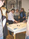
Stempeln mit Anja Lehtinen
|
Stamping with Anja Lehtinen Stamping is a different way to do calligraphy than using an ordinary broad edged nibs. By stamping technique you can easily create different surfaces from playful liveliness to bold, black and heavy textblock. In the workshop we will create an own individual alphabet and get familiar with the principles of cutting a stamp. |
|
Meisterklasse Denis Brown |
|
Masterclass Denis Brown Tune Up to Play Calligraphy |
|
|
Meisterklasse Denis Brown Das dritte Mal gibt der irische Kalligraf Denis Brown einen Workshop im Raum Regensburg. Aufbauend auf den Übungen der letzten Jahre führt Denis Brown die Teilnehmer weiter auf dem Weg zur Meisterschaft. Vom Gleichklang der Formen zu spielerischen Polyrhythmen und anderen Ausdrucksmöglichkeiten der kraftvoll eingesetzten Feder. Ein Workshop für Fortgeschrittene, die bereits an Kursen mit Denis Brown teilgenommen haben oder mit den kalligrafischen Ausdrucksmöglichkeiten, die Denis Brown schult, vertraut ist. Material: Bandzugfedern, speziell Brause 3 mm und 4 mm, Tinte, Gouachen - besonders weiss und schwarz und je nach Neiung auch einige Farben, Lineal, Bleistifte, Block Übungspapier (28 x 32 cm / 11''x 17'' oder größer), einige Blatt hochwertiges Papier, Rundpinsel (Größe 6 bis 8) Teilnahmebeitrag (inclusive Übernachtung und Vollverpflegung) 480,00 € |
Masterclass Denis Brown Rhythm, Polyrhythm and more A workshop for every calligrapher, who enjoy the swordmanship of Denis Brown and like to be introduced in his way of getting mastership. STUDENT SUPPLY LIST: |
|
|
Kraft in die Form drei Namen - eine Schrift: |
Calligraphy
|
|
|
Kalligrafie im Zeichen der Fraktur Materialien: |
|
|
Die Fraktur-Schriften Die Kraft der Gotik ist in der Schrift dieser Zeit erkennbar und erlebbar. |
 |
| Deutsche Schrift Die "deutschen Schriften" sind Kulturgut und auch heute noch im Alltag vertreten. |
 |
|
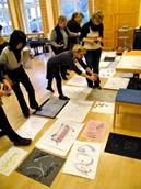
Workshop Kalligrafie Arbeiten an eigenen Themen unter Anleitung. Vorgegeben wird eine Tagesstruktur mit gemeinsamen Übungen zur Feinmotorik und Ausdrucksgestaltung. Hilfestellung bei Themanfindung und Themenvorgabe ist möglich. |
 |
|
Geschwungene Welten Der Kurs vermittelt Wissen um die Gesetzmäßigkeiten dieser kalligrafischen Bereicherungen, zeigt die Entwicklung gelungener Formen und gibt Möglichkeiten des Erübens. Material: weiche Bleistifte, Faserschreiber, Schwellzugfeder, ca. 10 Bögen Papier (mind. 40 x 60 cm), mind. 40 Blatt DIN A 4 Papier sowie gewohnte Kalligrafieausrüstung für eine mögliche Weiterarbeit an eigenen Projekten. |